Progress 进度条
逻辑分析
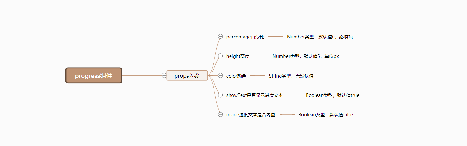
由于Progress进度条组件相对来说比较简单,只有几个props入参,所以我们整理后的思维导图如下:
组件开发
对于简单的Progress组件来说,我们直接一步到位,不需要拆分基础实现和完善。
准备
在src/base目录下新建progress目录,并在新建的src/base/progress目录中,再新建两个文件,分别是index.js和progress.vue。
# 新建 progress目录
$ mkdir progress

# 新建index.js和progress.vue文件
$ cd star
$ touch index.js
$ touch progress.vue
新建完毕后,src/base目录结构如下:
|-- base
|   |-- star
|   |   |-- index.js
|   |   |-- star.vue
|   |-- badge
|   |   |-- index.js
|   |   |-- badge.vue
|   |-- switch
|   |   |-- index.js
|   |   |-- switch.vue
|   |-- timeline
|   |   |-- index.js
|   |   |-- timeline.vue
|   |-- timeline-item
|   |   |-- index.js
|   |   |-- timeline-item.vue
|   |-- progress
|   |   |-- index.js
|   |   |-- progress.vue
同时我们为progress.vue文件,撰写以下基础代码:
progress组件注册参考Star组件。
<template>
  <div class="mooc-progress">
    progress
  </div>
</template>
<script>
export default {
  name: 'MoocProgress'
}
</script>
在以上步骤都正确完成后,我们在任意已经注册路由过的页面,使用progress组件,当出现progress文本内容即意味着progress组件已经全局注册成功了。
开发
根据上面的思维导图,我们列举progress组件的props入参:
percentage:百分比。height:高度。color: 颜色。showText: 是否显示进度内容。inside: 进度内容是否内显。
progress组件的html结构如下:
<div class="mooc-progress">
  <!-- bar -->
  <div
    ref="ProgressBar"
    class="mooc-progress-bar"
    :class="{
      'mooc-progress-bar-notext': !showText,
      'mooc-progress-bar-inside-text': inside
    }"
  >
    <div
      class="mooc-progress-bar-outer"
      :style="{
        height: `${height}px`
      }"
    >
      <div class="mooc-progress-bar-innter" :style="innerBarStyle">
        <div v-if="showText && inside" class="mooc-progress-bar-inner-text">
          {{ text }}
        </div>
      </div>
    </div>
  </div>

  <!-- text -->
  <div
    v-if="showText && !inside"
    ref="ProgressText"
    class="mooc-progress-text"
    :style="{
      'font-size': `${progressFontSize}px`
    }"
  >
    {{ text }}
  </div>
</div>
progress组件的js代码如下:
export default {
  name: 'MoocProgress',
  props: {
    percentage: {
      type: Number,
      default: 0,
      required: true,
      validator (val) {
        return val >= 0 && val <= 100
      }
    },
    color: String,
    height: {
      type: Number,
      default: 6
    },
    showText: {
      type: Boolean,
      default: true
    },
    inside: {
      type: Boolean,
      default: false
    }
  },
  computed: {
    innerBarStyle () {
      return {
        'width': `${this.innerPercentage}%`,
        'background-color': this.color
      }
    },
    innerPercentage () {
      return Math.max(0, Math.min(this.percentage, 100))
    },
    progressFontSize () {
      return 12 + this.height * 0.4
    },
    text () {
      return `${this.innerPercentage}%`
    }
  }
}
代码分析:
percentage:进度参数为必传参数,所以可以使用required:true进行限制。并且对于传递的percentage的值有要求:它们必须在0-100之间。这种验证形式当传递不合法的值(例如:120)会报错,但percentage的值依然是120,它依旧会反应在text内容上面,像下面这样,所以我们在内部又定义了一个计算属性innerPercentage,它主要作用依然是限制percentage的值必须在0-100之间。
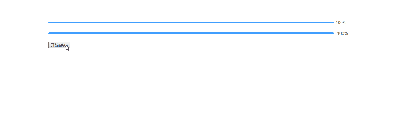
上为el-progress组件,下为mooc-progress组件。

progressFontSize: 当我们传递不同的height时,其对应的文字内容大小如果不一起跟随改动的话会显得不太合理,。所以定义一个progressFontSize的计算属性,让它根据传递的height来计算不同的字体大小,改动后的内容效果像下面这样:
Bug修复
在Element的progress组件中,如果我们是线性进度条的话,会根据传递的stroke-width进行计算font-size的大小。而在其css样式文件中,有如下这样一段代码:
@include b(progress-bar) {
  padding-right: 50px;
  margin-right: -55px;
}
当我们的进度文本内容宽度超过50px时,进度文本内容不会和进度条在同一条线上,下面是测试代码:
<el-progress :percentage="100" :stroke-width="15"></el-progress>
测试结果:

基于以上问题,我们需要做一些改动:
listenObj:新建listenObj计算属性,将可能对font-size影响的属性合并在一起,最后提供一个watch监听这个计算属性。当计算属性改变时,我们进行对应的计算。
export default {
  // 省略其它部分
  computed: {
    listenObj () {
      return {
        percentage: this.percentage,
        height: this.height
      }
    }
  },
  methods: {
    progressBarDistrance () {
      console.log('font-size')
    }
  },
  watch: {
    listenObj () {
      this.$nextTick(() => {
        this.progressBarDistrance()
      })
    }
  }
}
progressBarDistrance:在progressBarDistrance方法中,我们将进行一些计算。如果进度文本的宽度超过了我们制定的宽度的话,就改变其margin-right和padding-right的值,以达到让进度文本和进度条始终在一条线上。需要注意的时,当不显示进度文本或者进度文本内显示不需要做此处理。
export default {
  // 省略其它部分
  computed: {
    listenObj () {
      return {
        percentage: this.percentage,
        height: this.height
      }
    }
  },
  methods: {
    progressBarDistrance () {
      // 当不显示进度内容 或者进度内容内显时不计算
      if (!this.showText || this.inside) {
        return
      }
      const baseDistance = 50
      const textMarginLeft = 10
      let textWidth = this.$refs.ProgressText.clientWidth
      let progressBar = this.$refs.ProgressBar
      let margin = baseDistance
      let padding = baseDistance
      if (textWidth + textMarginLeft > baseDistance) {
        margin = textWidth + textMarginLeft + 1
        padding = textWidth + textMarginLeft
      }

      progressBar.style.marginRight = `${-margin}px`
      progressBar.style.paddingRight = `${padding}px`
    }
  },
  watch: {
    listenObj () {
      this.$nextTick(() => {
        this.progressBarDistrance()
      })
    }
  }
}
处理完以上内容后,我们进行一下必要的测试工作,使用如下代码进行测试:
上为el-progress组件,下为mooc-progress组件。
<el-progress :percentage="percentage" :stroke-width="height"></el-progress>
<mooc-progress :percentage="percentage" :height="height"></mooc-progress>

<button @click="handleStartClick">
  开始(高{{ height }})
</button>
export default {
  data () {
    return {
      height: 6,
      percentage: 100
    }
  },
  methods: {
    handleStartClick () {
      this.timer = setInterval(() => {
        this.height++
        if (this.height >= 50) {
          clearInterval(this.timer)
        }
      }, 100)
    }
  }
}
测试结果如下:
未来计划
正如你所看到的那样,我们实现的Progress进度条组件还只是基于最基础的用法,目前不能支持其它使用场景。所以我们对进度条组件列举如下未来计划:
- 支持状态颜色。
- 支持区间颜色。
- 支持环形进度条。
- 支持仪表盘进度条。
组件文档
在以上Progress组件完善以后,我们将得到一个比较完整的进度条组件,但仅仅只是有组件对我们来说并不是十分足够的,我们还需要撰写一份关于Progress组件的使用文档,组件文档结构按照以下内容来撰写:
- 用法:
Progress组件的用法以及对应的案例。 - 属性:
Progress组件每一个props属性的描述,包含类型,默认值以及说明。
Progress组件对应的文档地址为Progress组件文档,你可以点击这个地址查看更对内容。