Star 星级评分
逻辑分析
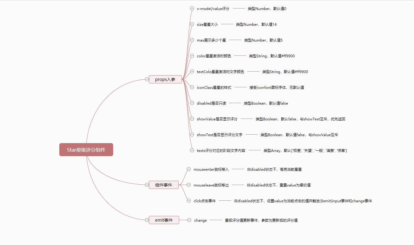
要整理Star组件的实现逻辑,我们从以下几个方面开始:
props入参:对于每一个参数的类型,默认值以及描述。- 组件
event事件:组件自身的事件,例如click和mouseenter等等。 - 组件
$emit事件:组件向父组件触发的事件,例如change事件。
根据以上的分类,我们使用百度脑图,整理后的逻辑分析如下:
组件开发
根据以上逻辑分析,我们将Star组件分为两步来实现:
- 基础实现:先实现
Star组件最主要的功能,例如v-model/value属性的实现。 - 组件完善:按思维导图,详细完善
Star组件的相关逻辑。
准备
划分好实现步骤后,我们需要做一些前期的准备工作,按照我们在准备中提到的目录结构和规则,我们需要做以下步骤:
在src/base目录下新建star目录,并在新建的src/base/star目录中,再新建两个文件,分别是index.js和star.vue。
# 新建 star目录
$ mkdir star

# 新建index.js和star.vue文件
$ cd star
$ touch index.js
$ touch star.vue
新建完毕后,src/base目录结构如下
|-- base
|   |-- star
|   |   |-- index.js
|   |   |-- star.vue
同时我们为star.vue文件,撰写以下基础代码:
<template>
  <div class="mooc-star">
    star
  </div>
</template>
<script>
export default {
  name: 'MoocStar'
}
</script>
为index.js撰写一下完整代码:
import Star from './star.vue'

Star.install = function (Vue) {
  Vue.component(Star.name, Star)
}

export default Star
随后,我们需要在根目录下新建register.js文件(文件名任意),并撰写以下代码:
// 通过别名访问,可以在`vue.config.js`中配置。
import Star from 'base/star/index.js'

const components = [
  Star
]

const install = function (Vue) {
  components.forEach(component => {
    Vue.component(component.name, component)
  })
}

if (typeof window !== 'undefined' && window.Vue) {
  install(window.Vue)
}

export default {
  install, // 这个方法非常重要
  Star
}
最后我们需要在项目的入口文件main.js中,引入register.js文件,像下面这样:
// ...省略其它部分
import Mooc from './register.js'
Vue.use(Mooc)

// ...省略其它部分
在以上步骤都正确完成后,我们在任意已经注册路由过的页面,使用mooc-star组件,当出现star文本内容即意味着Star组件已经全局注册成功了。
基础实现
项目中使用到的图标字体为iconfont,请根据自己需要引入对应的字体。
根据我们个人对于Star组件最主要的功能理解,我们将props属性和event事件做如下划分:
props入参:
value:星级评分的分值。max:星星的数量。color:激活时星星的颜色。disabled:只读模式。showValue:是否显示评分内容。
event事件:
mouseenter:鼠标移入事件。mousenleave:鼠标移出事件。click:鼠标点击事件。
根据以上划分,我们的基础html结构代码如下:
<div class="mooc-star">
  <span
    v-for="n in max"
    :key="n"
    class="mooc-star-item"
    :class="{
      'is-disabled': disabled
    }"
  >
    <i
      class="iconfont iconxingxing"
      :style="{
        color: color
      }"
    ></i>
  </span>
  <span
    v-if="showValue"
    class="mooc-star-text">
    {{ text }}
  </span>
</div>
基础javascript代码如下:
export default {
  name: 'MoocStar',
  props: {
    value: {
      type: Number,
      default: 0
    },
    max: {
      type: Number,
      default: 5
    },
    color: {
      type: String,
      default: '#ff9900'
    },
    showValue: {
      type: Boolean,
      default: false
    },
    disabled: {
      type: Boolean,
      default: false
    }
  },
  data () {
    return {
      currentValue: this.value
    }
  },
  computed: {
    text () {
      let result = ''
      if (this.showValue) {
        result = this.currentValue
      }
      return result
    }
  }
}
</script>
实现以上基础代码后,在没有撰写任何css的情况下,我们可以得到如下图所示的结果:

紧接着,我们来撰写必要的css:
我们把Star组件中关于变量的定义全部放在src/assets/theme/src/star-variables.styl文件中,如果你没有此文件,需要新建。
Star组件中定义的变量如下:
$star-item-margin-right = 6px;
$star-icon-hover-scale  = 1.15;
$star-icon-transition-duration = 0.3s;
$star-text-padding-left = 5px;
$star-text-font-size = 14px;
Star组件基础css代码:
@import '~assets/theme/src/star-variables.styl';
.mooc-star
  display: inline-block;
  .mooc-star-item, .mooc-star-text
    display: inline-block;
    vertical-align: middle;
  .mooc-star-item
    margin-right: $star-item-margin-right;
    cursor: default;
    &:last-child
      margin-right: 0;
    &.is-disabled
      pointer-events: none;
    &:not(.is-disabled)
      cursor: pointer;
      .iconfont
        display: inline-block;
        transition: all $star-icon-transition-duration;
      &:hover
        .iconfont
          transform: scale($star-icon-hover-scale);
  .mooc-star-text
    padding-left: $star-text-padding-left;
    font-size: $star-text-font-size;
接下来,我们来实现上面提到的事件:
html结构改动:
<div class="mooc-star">
  <span
    v-for="n in max"
    :key="n"
    class="mooc-star-item"
    :class="{
      'is-disabled': disabled
    }"
    @mouseenter="handleMouseEnter(n)"
    @mouseleave="handleMouseLeave"
    @click="handleStarClick(n)"
  >
    <i
      class="iconfont iconxingxing"
      :style="{
        color: getIconColor(n)
      }"
    ></i>
  </span>
  <span
    v-if="showValue"
    class="mooc-star-text">
    {{ text }}
  </span>
</div>
javascript改动部分:
export default {
  // ...省略其它部分
  methods: {
    handleMouseEnter (val) {
      if (this.disabled) {
        return
      }
      this.currentValue = val
    },
    handleMouseLeave () {
      if (this.disabled) {
        return
      }
      this.currentValue = this.value
    },
    handleStarClick (val) {
      if (this.disabled) {
        return
      }
      this.currentValue = val
      this.$emit('change', val)
      this.$emit('input', val)
    },
    getIconColor (val) {
      return val <= this.currentValue ? this.color : '#eee'
    }
  }
}
最后我们在任意测试页面来测试一下Star组件,使用如下方式进行基础测试:
<div class="home">
  <mooc-star v-model="starVal"></mooc-star>
  {{starVal}}
</div>
export default {
  data () {
    return {
      starVal: 3
    }
  }
}
测试结果如下:

组件完善
Star组件实现了基础功能后就完成了我们预定的Star组件大部分功能,接下来我们将对Star组件进一步完善。
props入参:
size: 星级评分的大小。texts: 评分的内容。showText: 是否显示评分的内容。textColor: 评分内容的颜色。
完善后的html代码(改动为高亮部分):
<div class="mooc-star">
  <span
    v-for="n in max"
    :key="n"
    class="mooc-star-item"
    :class="{
      'is-disabled': disabled
    }"
    @mouseenter="handleMouseEnter(n)"
    @mouseleave="handleMouseLeave"
    @click="handleStarClick(n)"
  >
    <i
      class="iconfont iconxingxing"
      :class="iconClass"
      :style="{
        'font-size': `${ size }px`,
        'color': getIconColor(n)
      }"
    ></i>
  </span>
  <span
    v-if="showValue || showText"
    class="mooc-star-text"
    :style="{
      'color': textColor,
      'font-size': `${ size }px`
    }"
  >
    {{ text }}
  </span>
</div>
完善后的javascript代码如下(仅改动部分):
export default {
  // ... 省略其它部分
  props: {
    size: {
      type: Number,
      default: 14
    },
    textColor: {
      type: String,
      default: '#ff9900'
    },
    showText: {
      type: Boolean,
      default: false
    },
    texts: {
      type: Array,
      default () {
        return ['极差', '失望', '一般', '满意', '惊喜']
      }
    },
    iconClass: String
  },
  computed: {
    text () {
      let result = ''
      if (this.showValue) {
        result = this.currentValue
      } else if (this.showText) {
        result = this.texts[this.currentValue - 1]
      }
      return result
    }
  }
}
在我们完善Star组件后,我们需要进行一些必要的测试工作,我们使用如下的代码来进行测试:
<div class="home">
  <mooc-star
    v-model="starVal"
    :size="30"
    icon-class="iconbanxing"
    :show-text="true"
  ></mooc-star>
</div>
export default {
  name: 'home',
  data () {
    return {
      starVal: 3
    }
  }
}
测试结果如下图所示:

未来计划
正如你所看到的那样,虽然我们支持v-model,但并不支持表单,也同样不支持半星等等问题,因为我们是以业务为导向,根据业务来逐步完善我们代码的,所以我们对未来做了一些Star组件的迭代计划:
- 支持
form表单。 - 支持半星。
- 支持未激活时,星星的颜色。
- 支持未激活时,文字的颜色。
组件文档
在以上Star组件完善以后,我们将得到一个比较完整的星级评分组件,但仅仅只是有组件对我们来说并不是十分足够的,我们还需要撰写一份关于Star组件的使用文档,组件文档结构按照以下内容来撰写:
- 用法:
Star组件的用法以及对应的案例。 - 属性:
Star组件每一个props属性的描述,包含类型,默认值以及说明。 - 事件:
Star组件相关的事件说明以及对应的案例。
Star组件对应的文档地址为Star组件文档,你可以点击这个地址查看更对内容。